Built as a swiss knife.
Redesigned as a scalpel.
Context
Aiir is the AI layer on top of borescope inspection for jet engines. The domain runs on trust, because a missed defect grounds an aircraft and costs millions. Lessors love every AI finding. Inspectors read the same findings as a quiet accusation that they missed something.
Approach
Redesign the AI-facing surfaces around the inspector — the user the AI supposedly threatens — rather than the lessor already sold on it. Standardize a feature-piled product into a context-aware one, and instrument it so the trust curve could be measured, not assumed.
Outcome
Processing time per hour of footage dropped from 18 to 12 minutes. Edits after sign-off fell 38%. 86% of customers renewed, several citing the new workflow as a reason.
Processing time, post-sign-off edits, and renewal measured across KLM, Lufthansa, and FTAI running the redesigned overview in production.

Serves everyone. Delights no one.
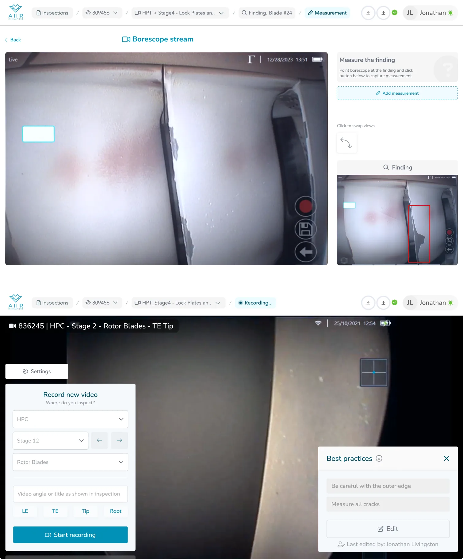
Borescope inspection is looking inside a jet engine through a fibre-optic probe, one blade at a time, and deciding whether the aircraft flies tomorrow.
A missed defect is millions of euros. A grounded plane, a scrambled replacement, cancelled obligations.
The work moves in phases — capture, process, review, report — and each phase has its own tools, its own stakes, its own things you can and can't do yet.
One tool, every phase.
Aiir was built to help with all of it. But it came as a swiss-army knife — every control on every screen, regardless of the engine segment in front of you or the phase you were in.
Powerful on paper. In practice, inspectors had to translate it into their own workflow every time they opened the app.
A UI that shows you everything at once doesn't just waste space. It asks the inspector to hold the whole mental model themselves, on top of a job that already demands it.
My job was to reshape the product around that reality. Still flexible, still one tool — but tailored to the segment in front of you and the phase of inspection you're in.
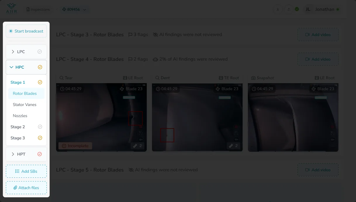
The overview was mislabeled.
An inspection is a structure wrapped around a workflow. The old overview rendered the structure faithfully and ignored the workflow.
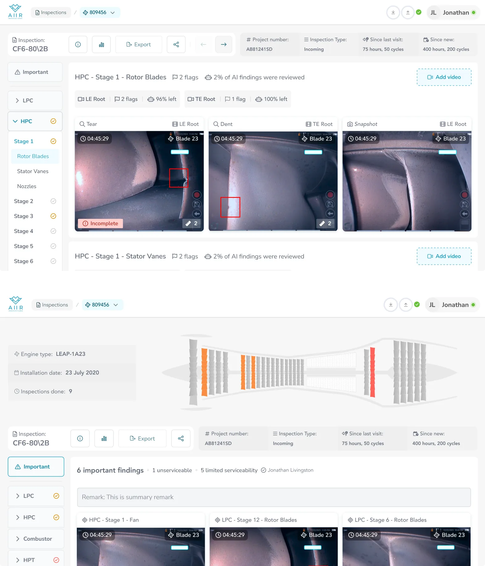
The old page tried to be both map and file browser at once, rendered as a tree of rows.
Every row was a dossier — signed-by pill, finding count, disposition badge, date, duration, five action icons, chrome-heavy toolbar.
Technically complete.
It broke in three specific places.

Issues with the old overview
-
Button-heavy top
The overview opened with a dense row of toolbar buttons before any content — chrome overwhelming the hero of the inspection itself.
-
One layer down
To see what was reported from a given video, the reader had to click into the row and open its video page — the findings, the one thing everyone came for, never surfaced on the overview itself.
-
20+ rows
Every video in the inspection was listed as its own full-width row. The page was a directory of footage, not an answer to "where am I in this inspection right now?"
ReframeThe page wasn't a file browser. It was a preview of the report.
The videos were the input. The report was the output.
An inspector's work was moving findings from one side of the line to the other.
So the page had to show the output. The inputs could file themselves underneath.
 1
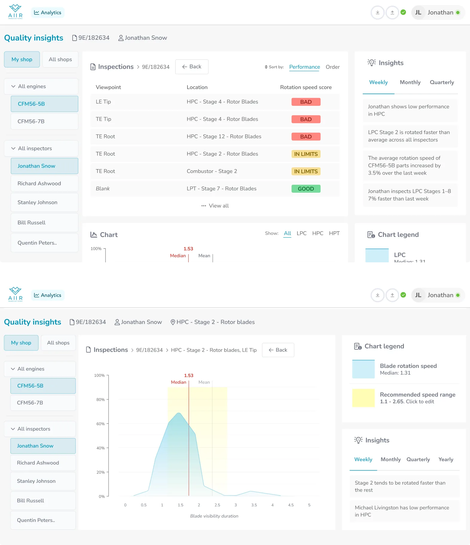
Important. Default landing for lessors and guests — every reported finding across the inspection, sorted by severity. Inspectors mid-shift land on module drilldown instead.
2
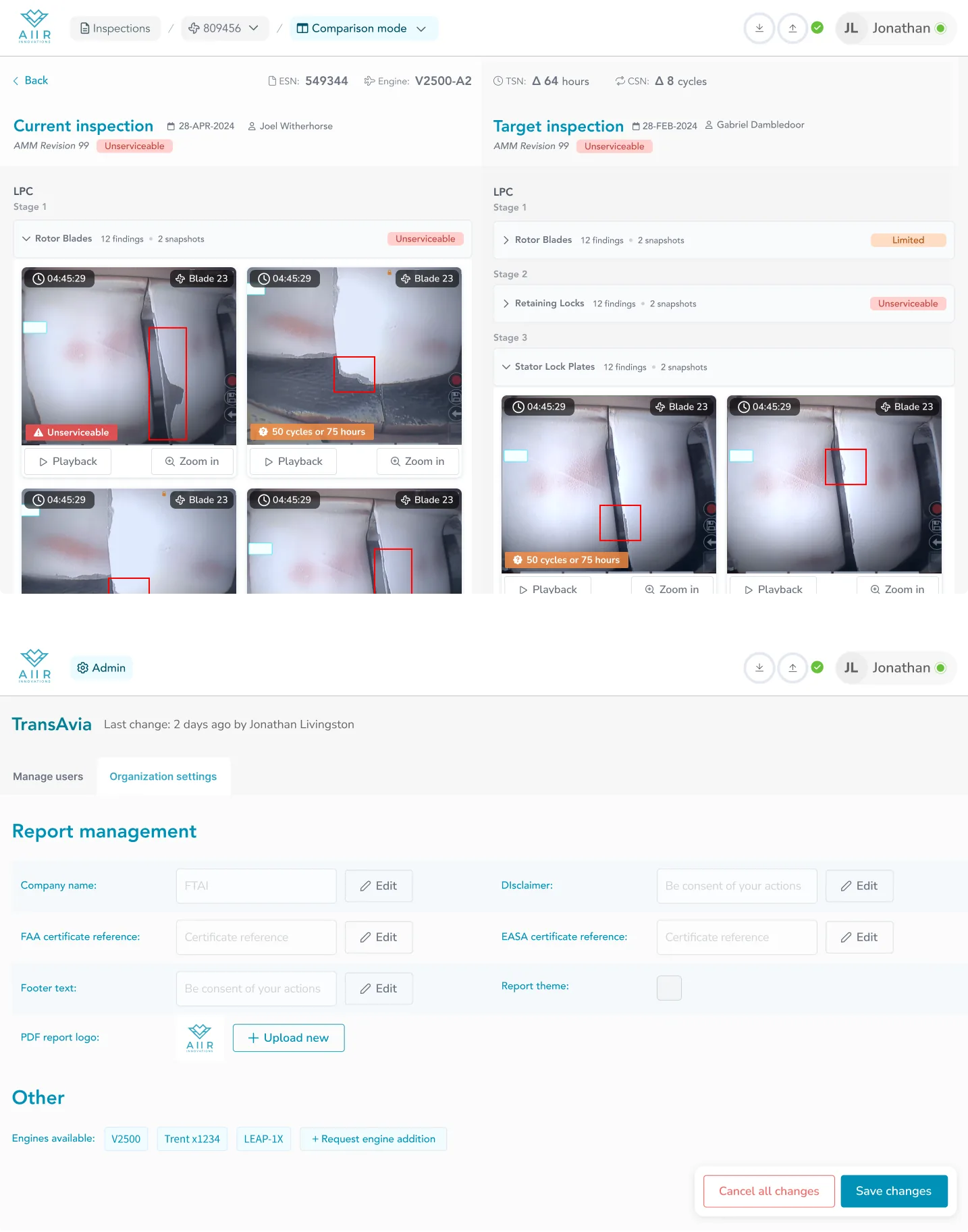
Engine schematic. Stylised cross-section with per-stage colour: grey for serviceable, orange for limited serviceability, red for unserviceable. Hardest finding wins per stage. Gives any reader a spatial read of the engine before they drop into any module.
3
Engine meta, not inspection meta. Type, installed-on, lifetime inspection count. Persists across inspections of the same engine — this is the anchor for the engine-over-time view a manager reaches through the arrows in the action bar.
4
Sticky action bar. Identity on the left, CTA on the right. Covered below.
5
Findings wrap. Severe-and-incomplete first. Because Important aggregates findings from across the whole engine, each card leads with its location (stage + blade + position), then a timestamp into the source video and the inspector's disposition.
1
Important. Default landing for lessors and guests — every reported finding across the inspection, sorted by severity. Inspectors mid-shift land on module drilldown instead.
2
Engine schematic. Stylised cross-section with per-stage colour: grey for serviceable, orange for limited serviceability, red for unserviceable. Hardest finding wins per stage. Gives any reader a spatial read of the engine before they drop into any module.
3
Engine meta, not inspection meta. Type, installed-on, lifetime inspection count. Persists across inspections of the same engine — this is the anchor for the engine-over-time view a manager reaches through the arrows in the action bar.
4
Sticky action bar. Identity on the left, CTA on the right. Covered below.
5
Findings wrap. Severe-and-incomplete first. Because Important aggregates findings from across the whole engine, each card leads with its location (stage + blade + position), then a timestamp into the source video and the inspector's disposition.
-
1
Important. Default landing for lessors and guests — every reported finding across the inspection, sorted by severity. Inspectors mid-shift land on module drilldown instead.
-
2
Engine schematic. Stylised cross-section with per-stage colour: grey for serviceable, orange for limited serviceability, red for unserviceable. Hardest finding wins per stage. Gives any reader a spatial read of the engine before they drop into any module.
-
3
Engine meta, not inspection meta. Type, installed-on, lifetime inspection count. Persists across inspections of the same engine — this is the anchor for the engine-over-time view a manager reaches through the arrows in the action bar.
-
4
Sticky action bar. Identity on the left, CTA on the right. Covered below.
-
5
Findings wrap. Severe-and-incomplete first. Because Important aggregates findings from across the whole engine, each card leads with its location (stage + blade + position), then a timestamp into the source video and the inspector's disposition.
Completed inspection, Important mode — the lessor's default view. Hover or tap a number to read its note.
The sidebar as the new spine
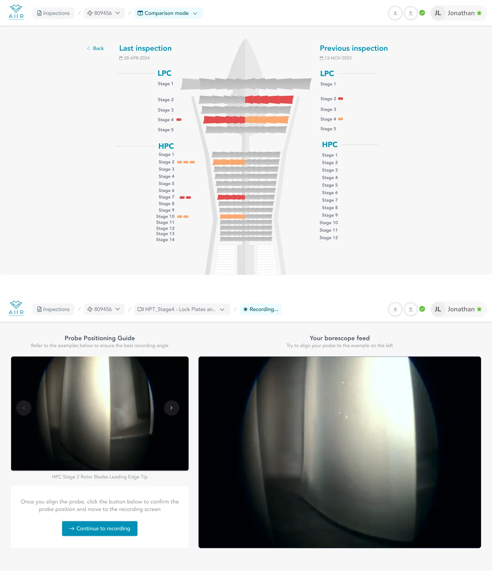
The old full-width rows became a sticky left rail — a collapsed tree, only the active stage open.
Signed stages show a checkmark, tinted by the hardest disposition.
Two-way scrollspy. A reader can ignore it and still know where they are.
Attachment slot at the bottom for readers with permission.
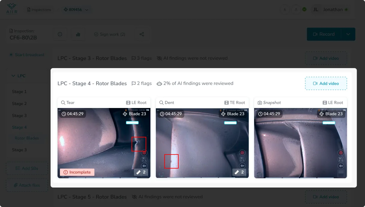
Row anatomy in module drilldown
Inside the content pane, every row is one module-stage-part.
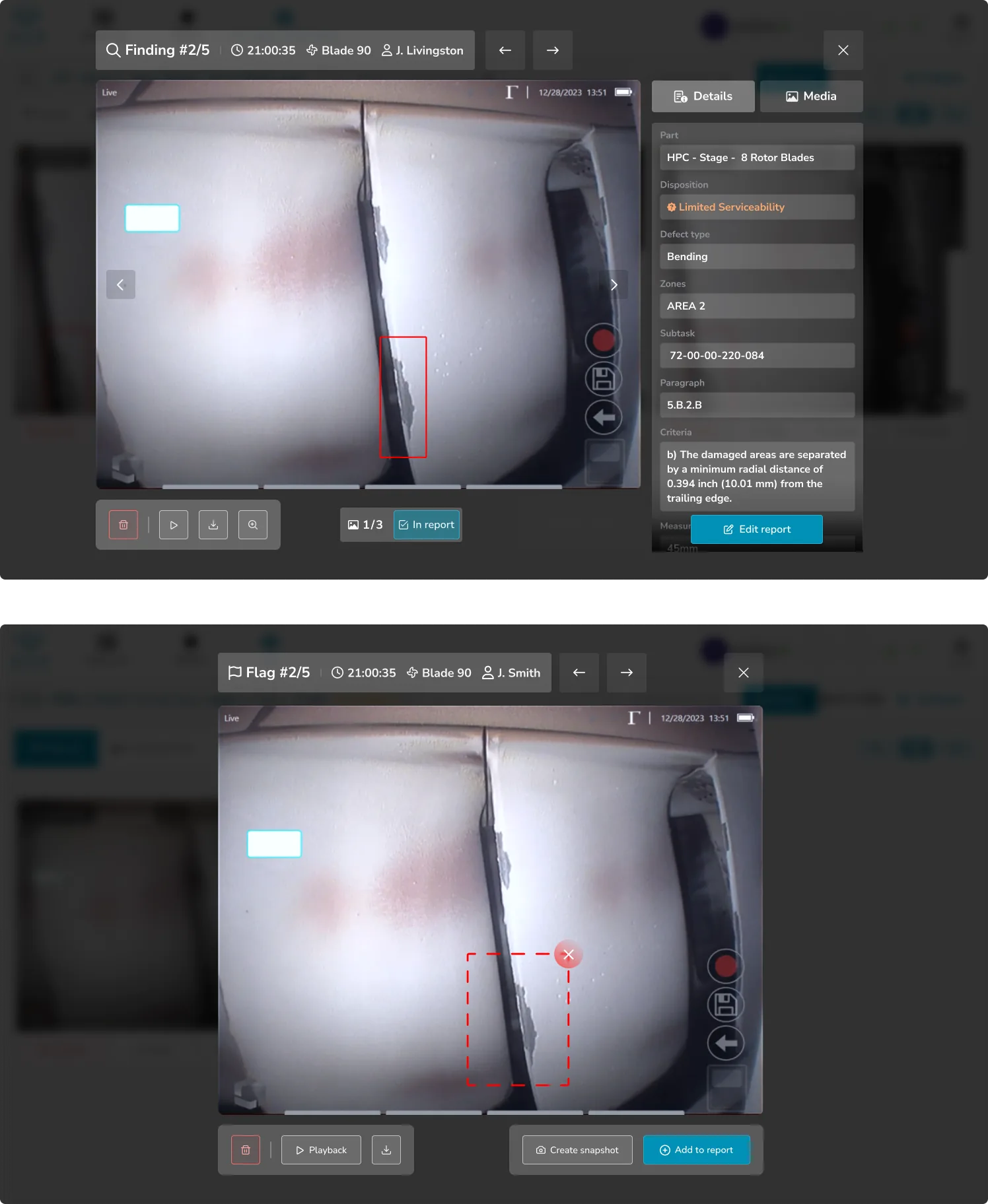
The header surfaces two things: flag count and AI-review status.
Flags are screenshots the inspector bookmarked mid-recording — "I'll need that image in the report."
The reader can decide at a glance whether to open it.
Collapsed row states — empty, processing, awaiting review. Header only, one decision: open or skip.
Reported findings sit below in a carousel, severe-and-incomplete first.
When a part was inspected through more than one video, those videos become grey tags on the row header and findings aggregate across them.
The row still tells one story per part, not one per file.
In read-only mode the chrome strips: no tags, no flags, no AI-review counts.
The disposition badge, the signer, the inspector's remark, and a compact "N videos" popover replace the working affordances.
Same shell, lighter weight.
An action bar that flexes to the role
The row just below the navbar is the inspection's identity on the left, primary CTA on the right.
It adapts to who's looking. Share, quality-insights, and the arrows that walk an engine across its inspections all hide when permission says no.
The CTA on the right is never the same twice in a row — it flips with state and role.


Same identity, one CTA at a time — the audience only ever cares about one of them.
The point wasn't adaptive UI as a feature.
It was that the product had to serve three audiences from one screen, and each one only ever cares about one action at a time.
Everything else stays out of the way.
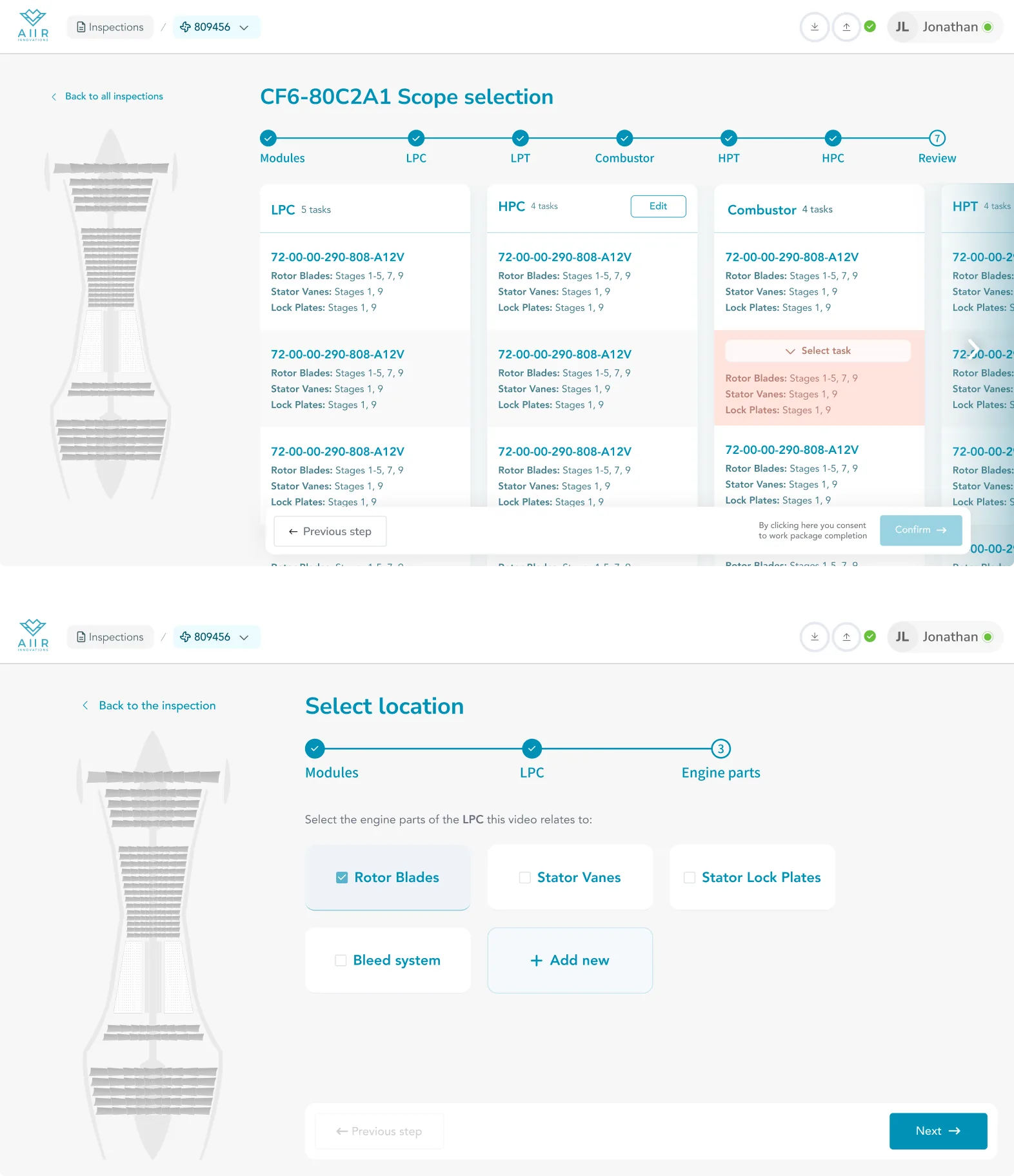
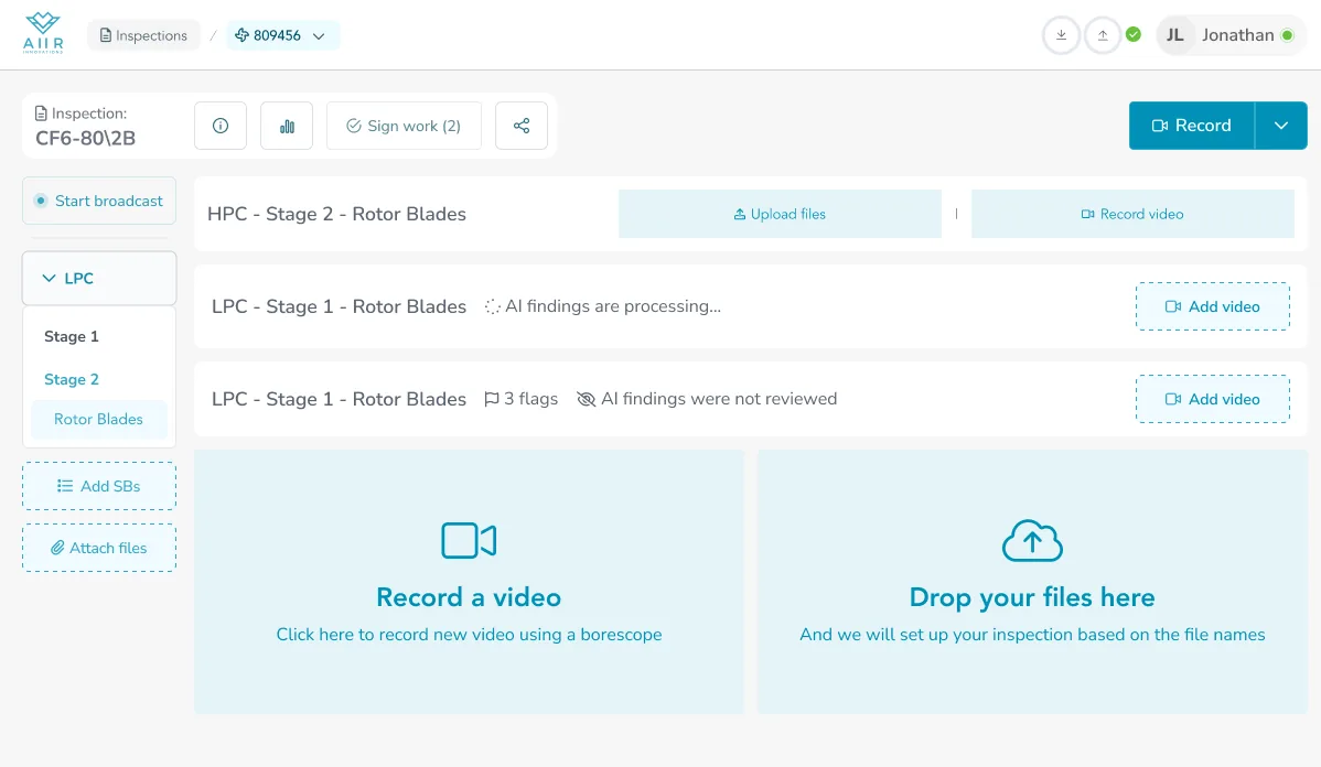
Two modes: I work, I look
Same shell, two intents.
An inspector mid-shift needs a workbench. The schematic collapses, dropzones surface at the bottom of the scroll ("Record a video" and "Drop your files here"), every affordance points at the next recording.
A lessor, a guest, or a signed-off inspector just needs a report. Schematic open at the top, findings preview underneath, no tools in the way.
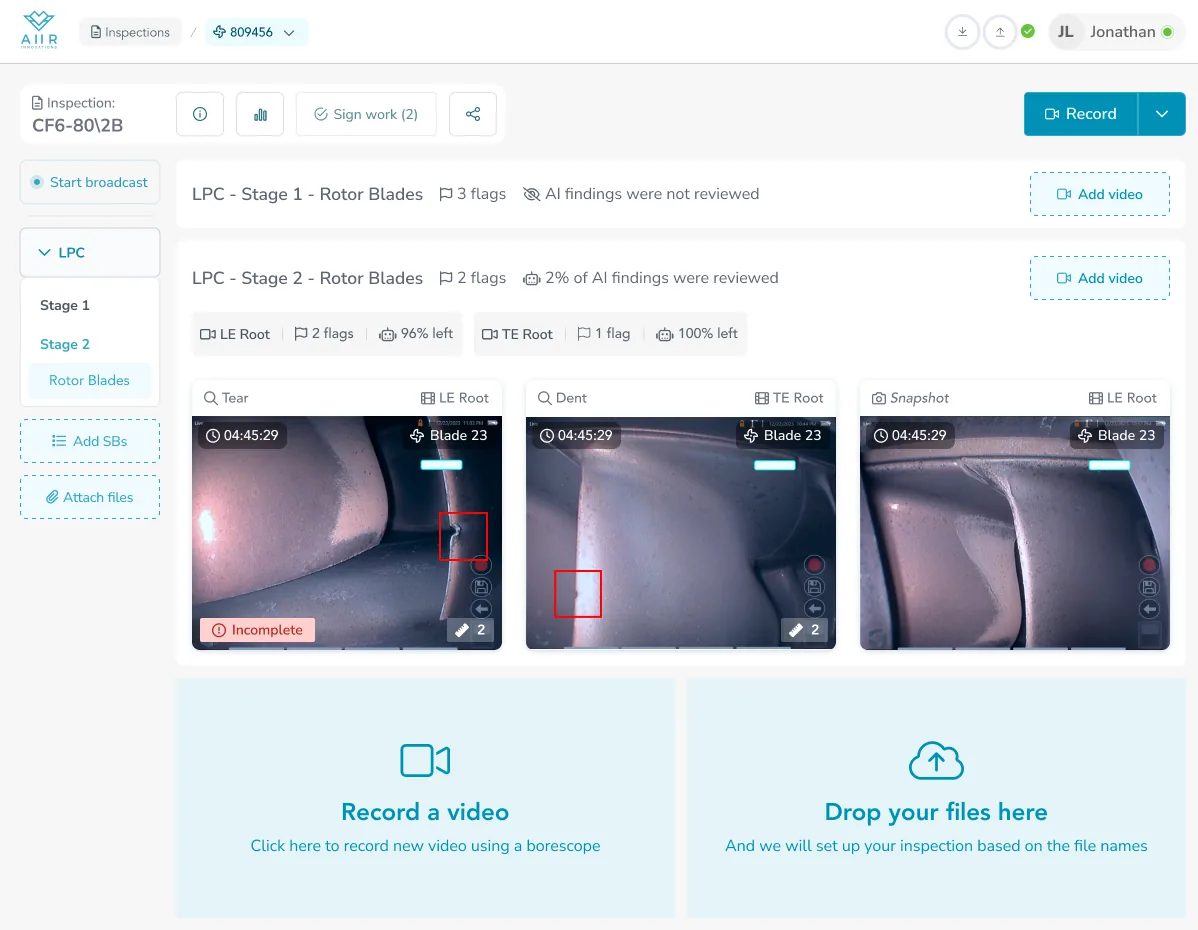
Below the schematic both states share the same sidebar + content pane structure. Both share the sticky action bar.
What changes is which affordances are on and who's expected to act on them.
One shell, three readers — inspector working, inspector signing off, lessor reviewing — served by a layout that doesn't pretend they all want the same page.
The Line Maintenance "engine over time" view the old overview had no room for slots in here as a fourth reader.
The sidebar becomes a list of inspections rather than modules, the action bar picks up the arrows, the schematic aggregates dispositions across the timeline.
Same shell.
Five modules, every row a dossier → one schematic, one spine, one sequence of findings.
What the redesign actually moved.
The redesigned overview is in production across three tier-1 MROs and 24 countries. Three numbers to look at: how long inspectors spend in the software, how often they change their mind after signing off, and whether customers come back.
Time-in-software after recording — review and reporting work, measured per hour of borescope footage. From 18 minutes before the redesign to 12 after. A third less time on the same volume of work.
Mostly a design win. The overview surfacing findings directly removed the click-into-video-page round trip that used to dominate review time.
An inspector marks the inspection complete, then comes back to change something and sign off again — usually a miss they caught on re-read, or a finding they reinterpreted.
Down 38% after the redesign. The overview is doing the second-pass job that a second pass used to do — fewer “wait, I missed that” moments, more trust in the first sign-off.
86% of MRO customers renewed after the redesign rolled out. In renewal conversations, several cited the new workflow directly — a few called it the best in the industry.
Internal efficiency is the metric that moves first. Renewal is the metric that proves it stuck.
What I'd do differently.
Break the scope further. Ship in smaller iterations.
I argued the redesign only worked if the key surfaces moved together — sidebar, action bar, schematic, row anatomy, read-only mode. Any less and the product would read half old, half new for months, and the new concept wouldn't land “properly.”
In hindsight: that’s fine.
Users would have lived with temporary visual inconsistency for some time. What I gave up — what I now wish I hadn’t — was the faster feedback loop.
Smaller releases mean each decision lands in isolation. Overview-as-report first. Sidebar second. Action bar third. Read what’s not working before the next piece ships, react while the team still remembers the decision.
Coherence is a product value. So is speed to learn. I weighed the first higher than it deserved.