Two apps that share a transaction
but not a mindset.
Context
A startup approached our product studio to design their local services marketplace — plumbing, cleaning, repairs. Two mobile apps: one for customers posting tasks, one for specialists bidding on work. I led the product design from research through shipped product.
Approach
Competitive analysis across 7 platforms, then guerrilla interviews with both sides. The client had assumptions about differentiation — they encouraged me to validate or disprove them before committing to pixels.
Outcome
10K+ users. Shipped two apps with differentiated experiences — same transaction, different interfaces for each side.
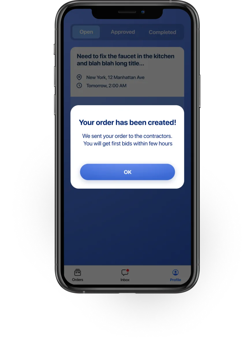

Customer + specialist apps designed and tested end-to-end. Prototypes tested with 3 specialists and 3 customers before development.


The tension
Customers think in problems: "my sink is broken." They want speed, trust signals, and minimal friction. They have one task and zero patience for registration.
Specialists think in availability and reputation: "where's my next gig?" They're on 3–5 platforms simultaneously, scanning for volume, and very familiar with onboarding flows.
The client's initial brief was to build one app for both. The research made clear that treating them the same would serve neither well. I recommended two separate apps from the start — same backend, completely different interfaces.
Split the product before designing a single screen.
The client's brief asked for one app with a role switch. I pushed back in the first week. Serving two users from the same interface would mean every screen carried the compromises of both.
So the first design decision was architectural, not visual. Two apps, one backend. Same orders, same chat, same payment flow underneath — entirely different surfaces on top.
Everything downstream — the three decisions below — fell out of this split. Different onboarding, different chat surface, different map treatment. Same order ID moving through the middle.
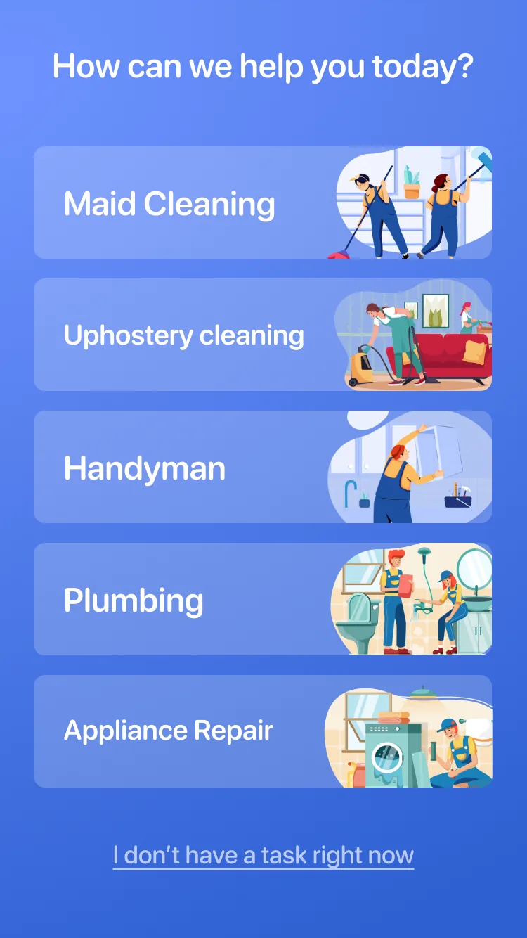
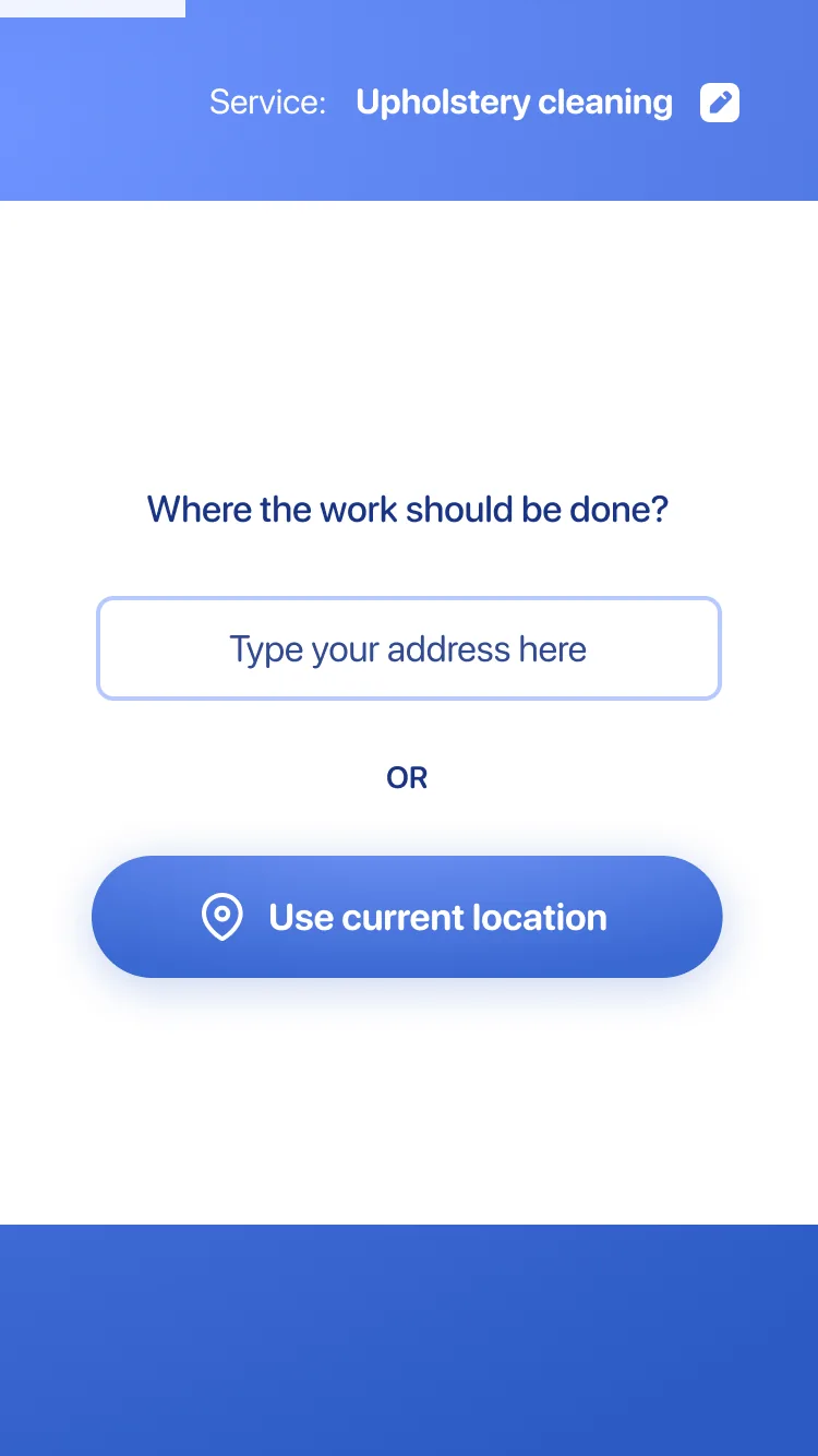
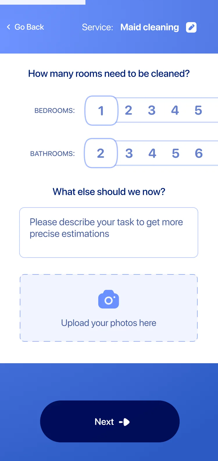
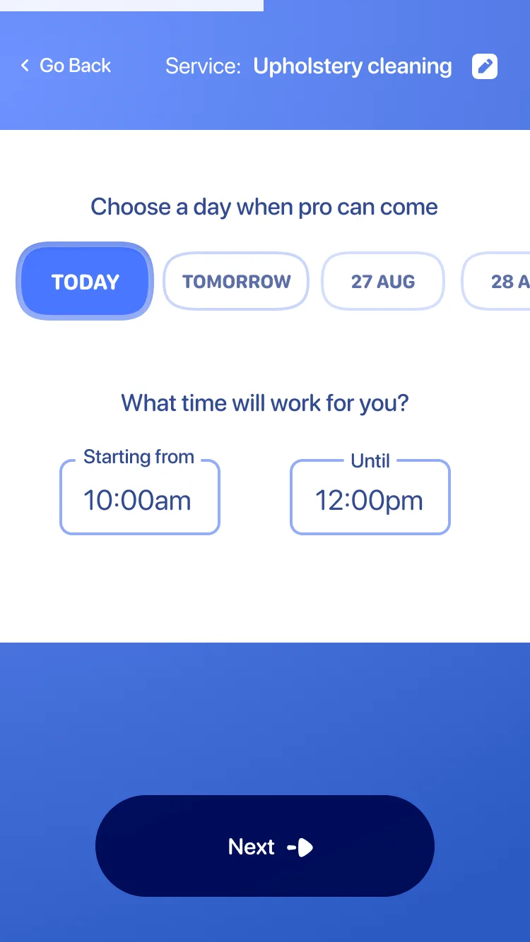
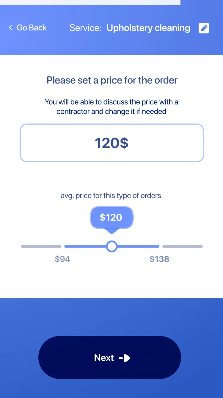
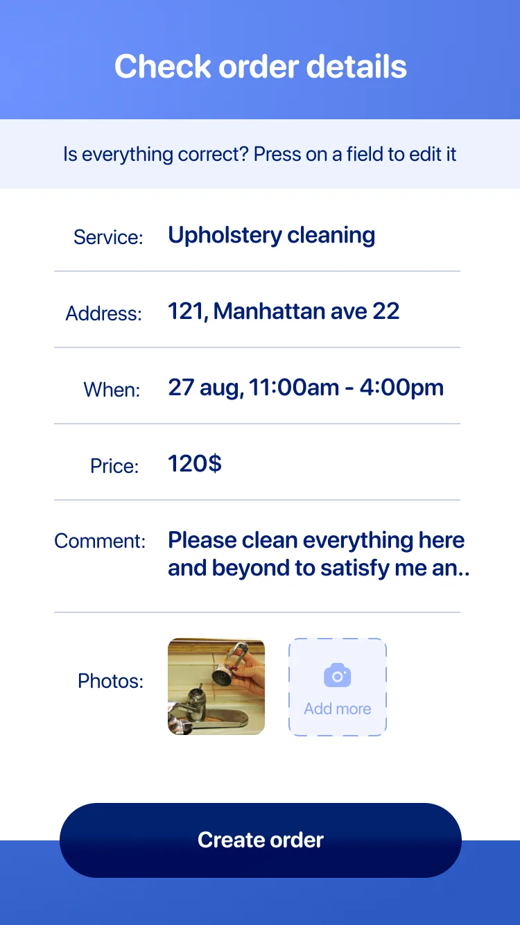
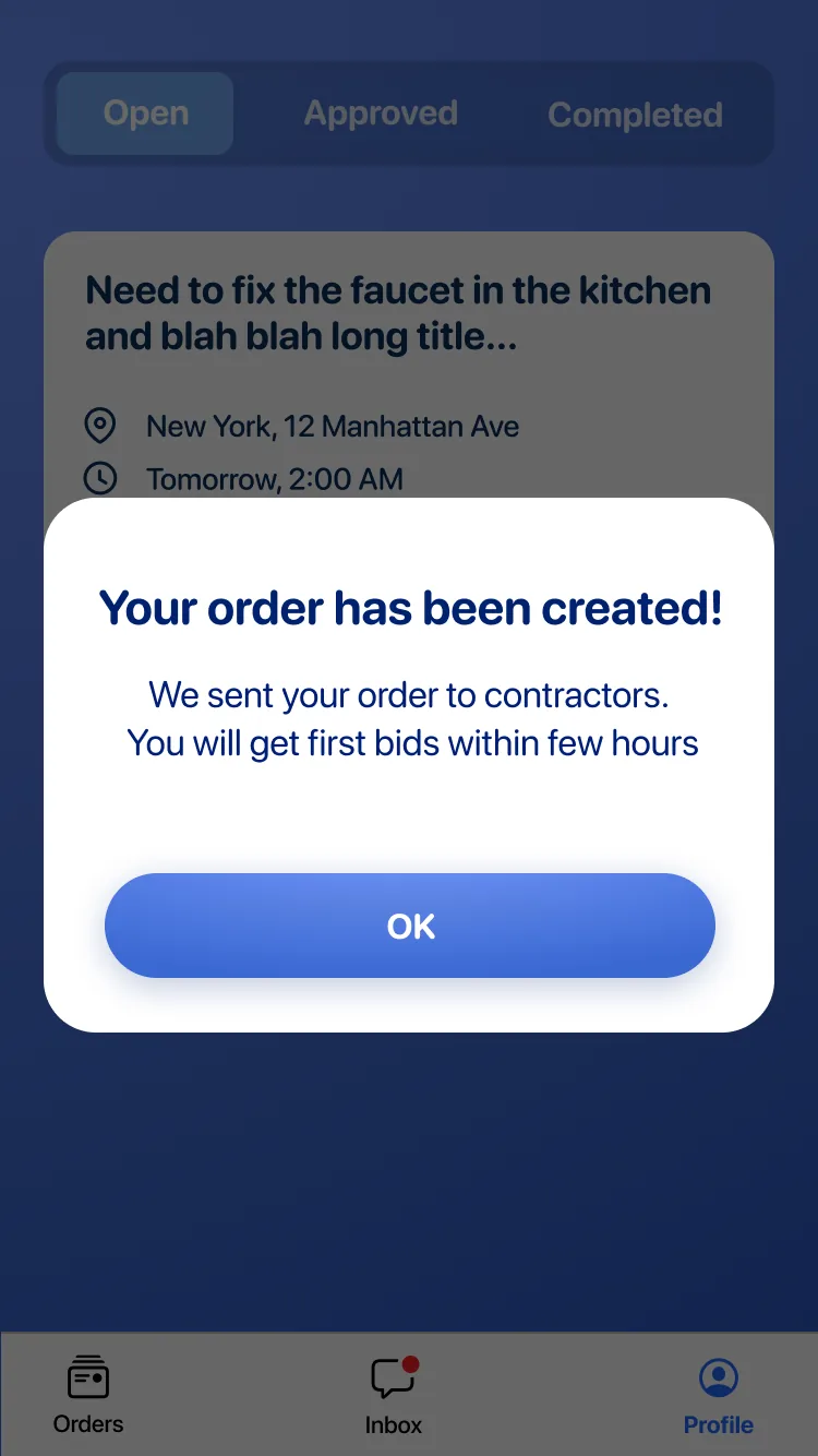
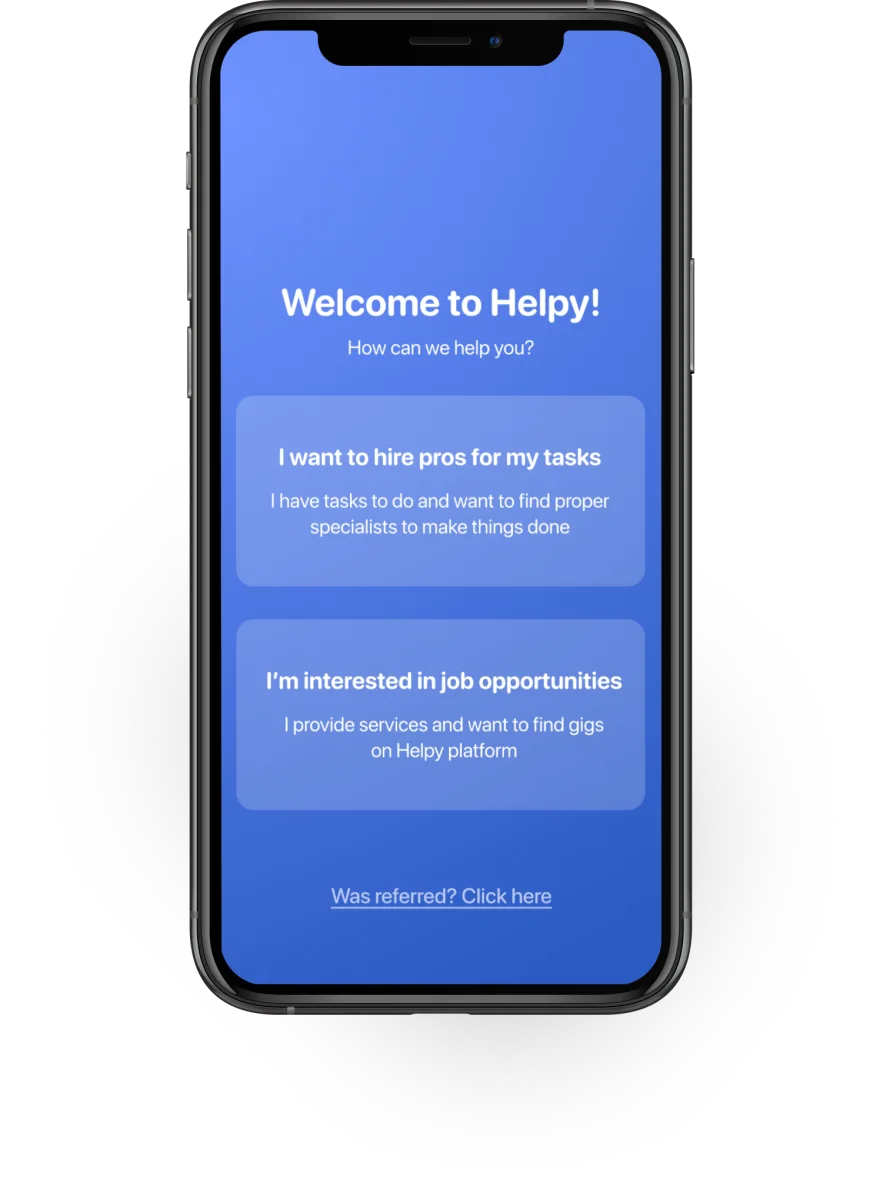
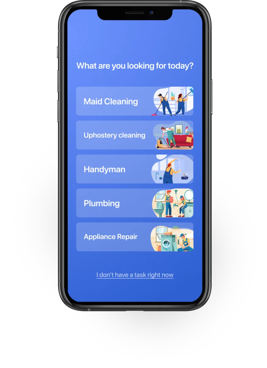
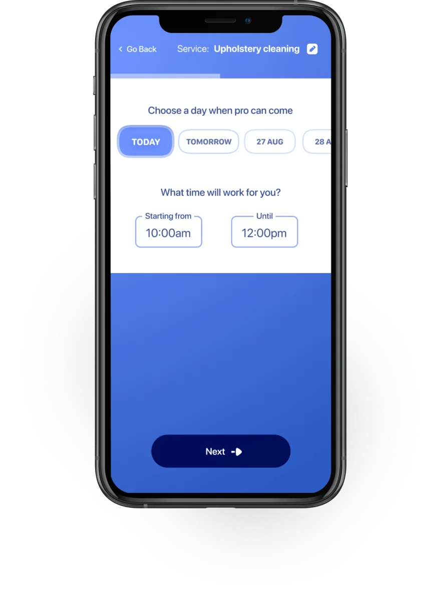
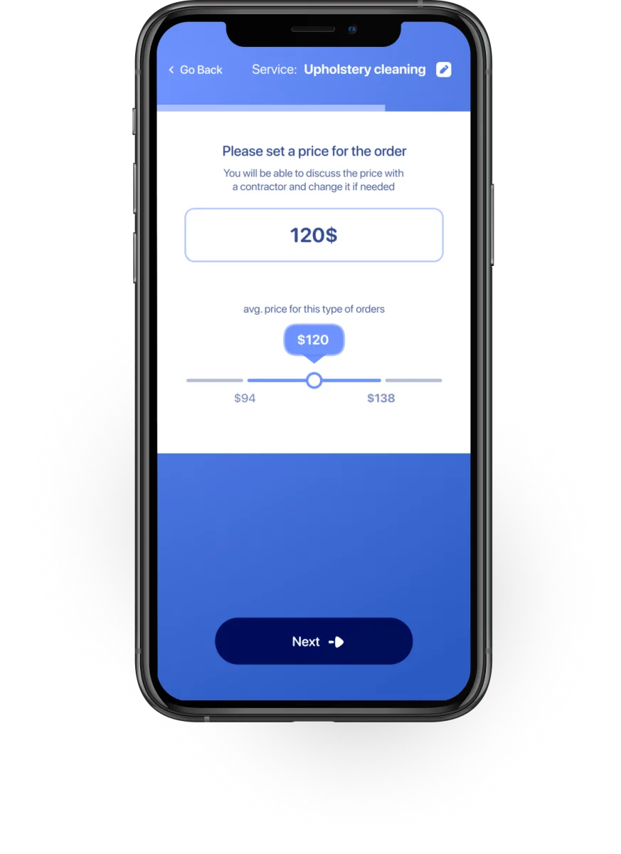
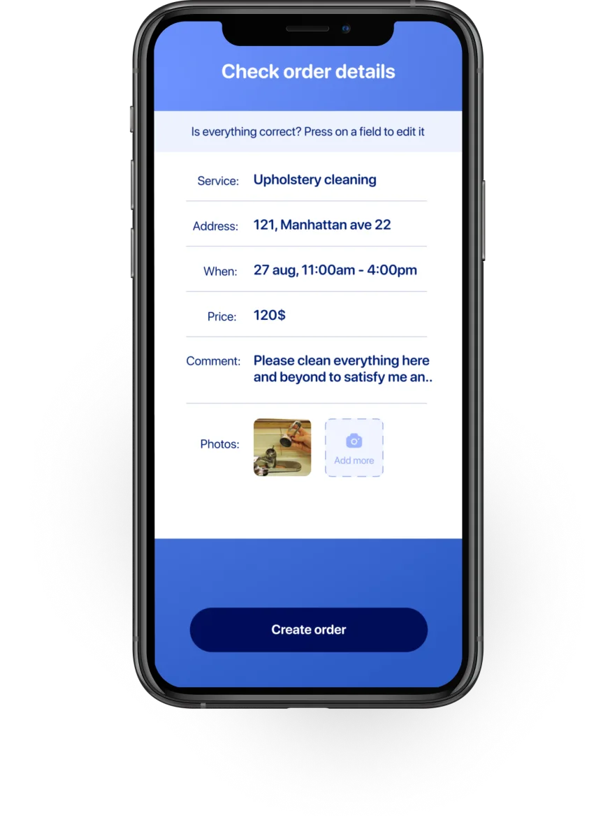
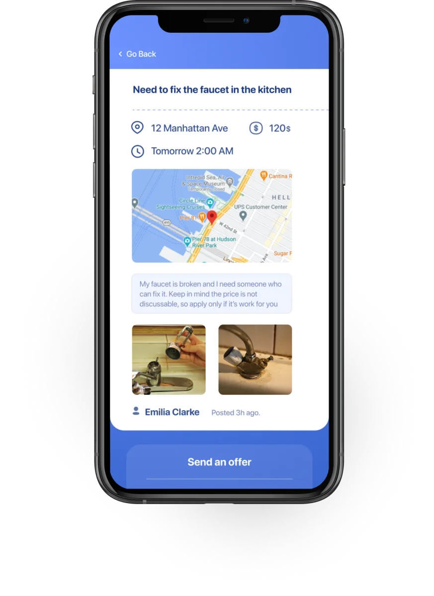
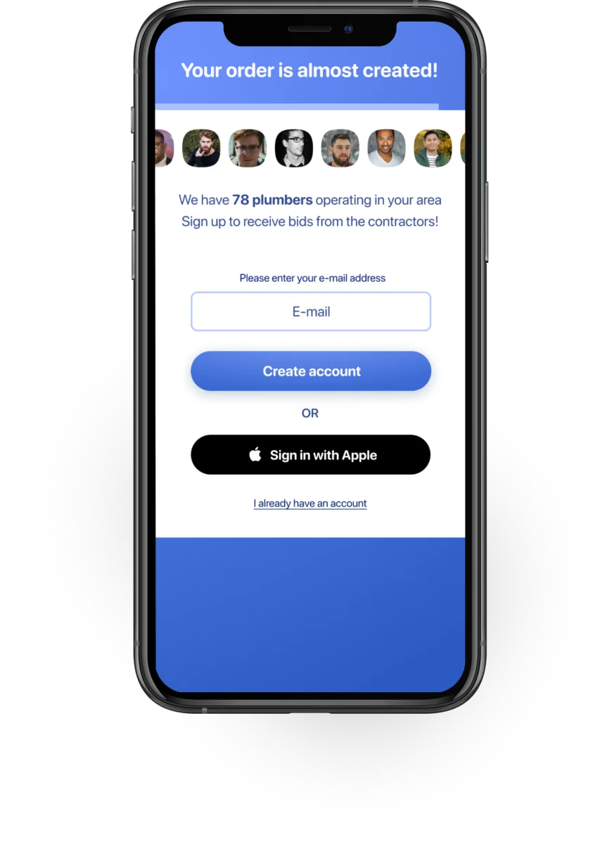
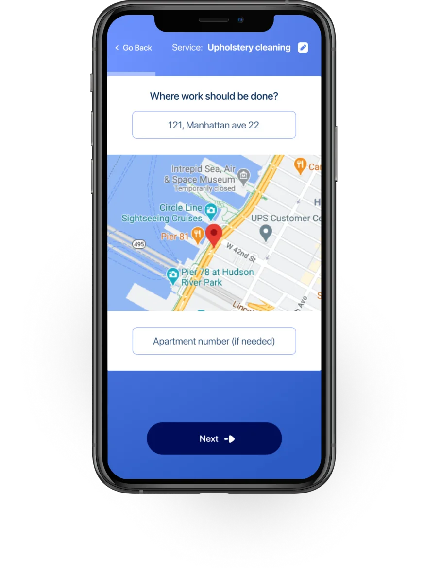
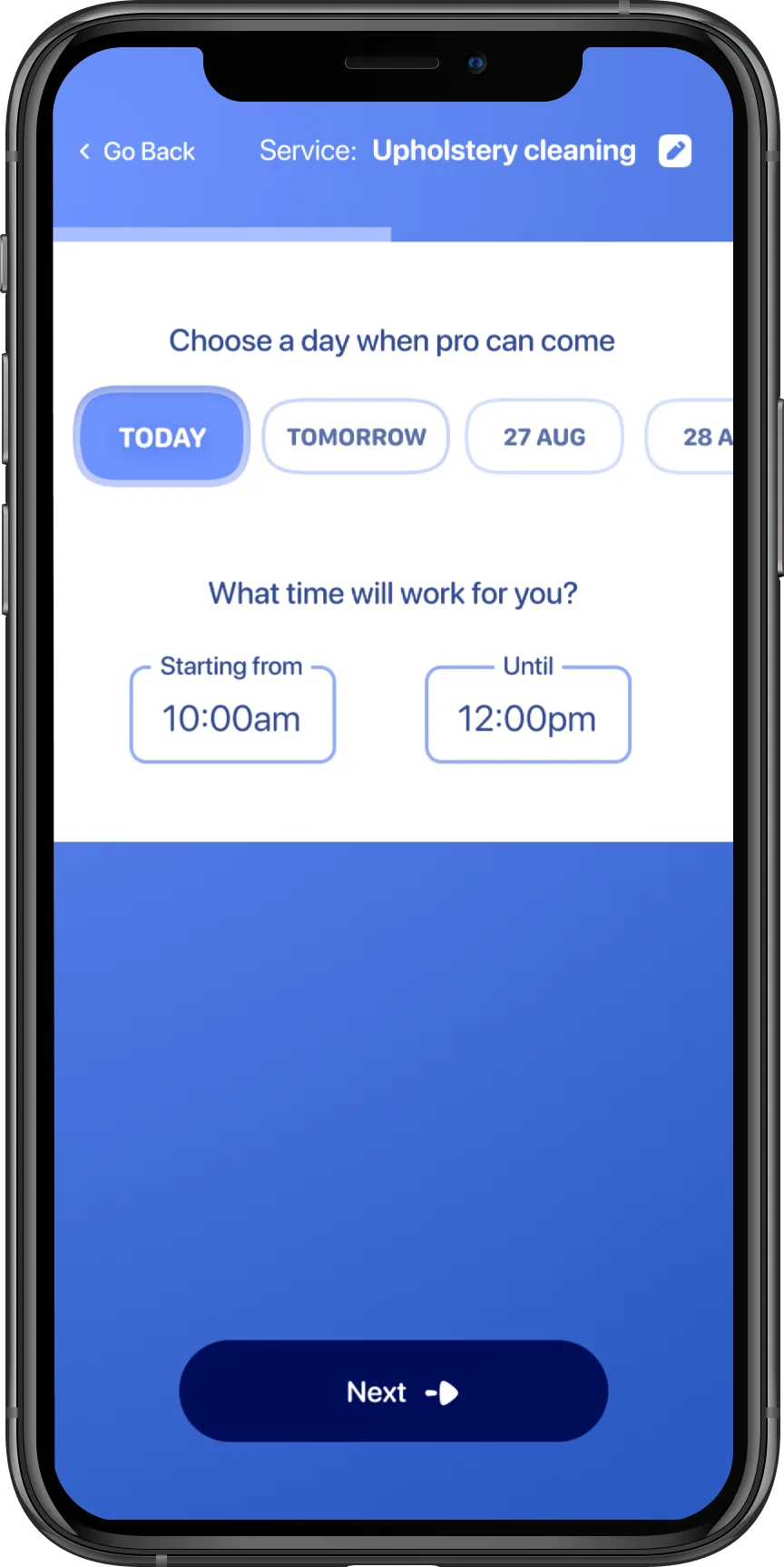
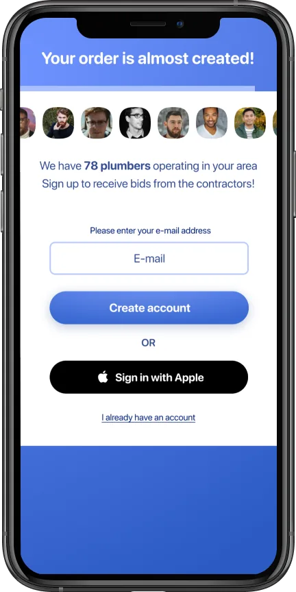
The full customer flow: service → address → details → date → price → confirm → signup wall → verify. Registration comes last, when they're already invested.
Ask different questions at different times.
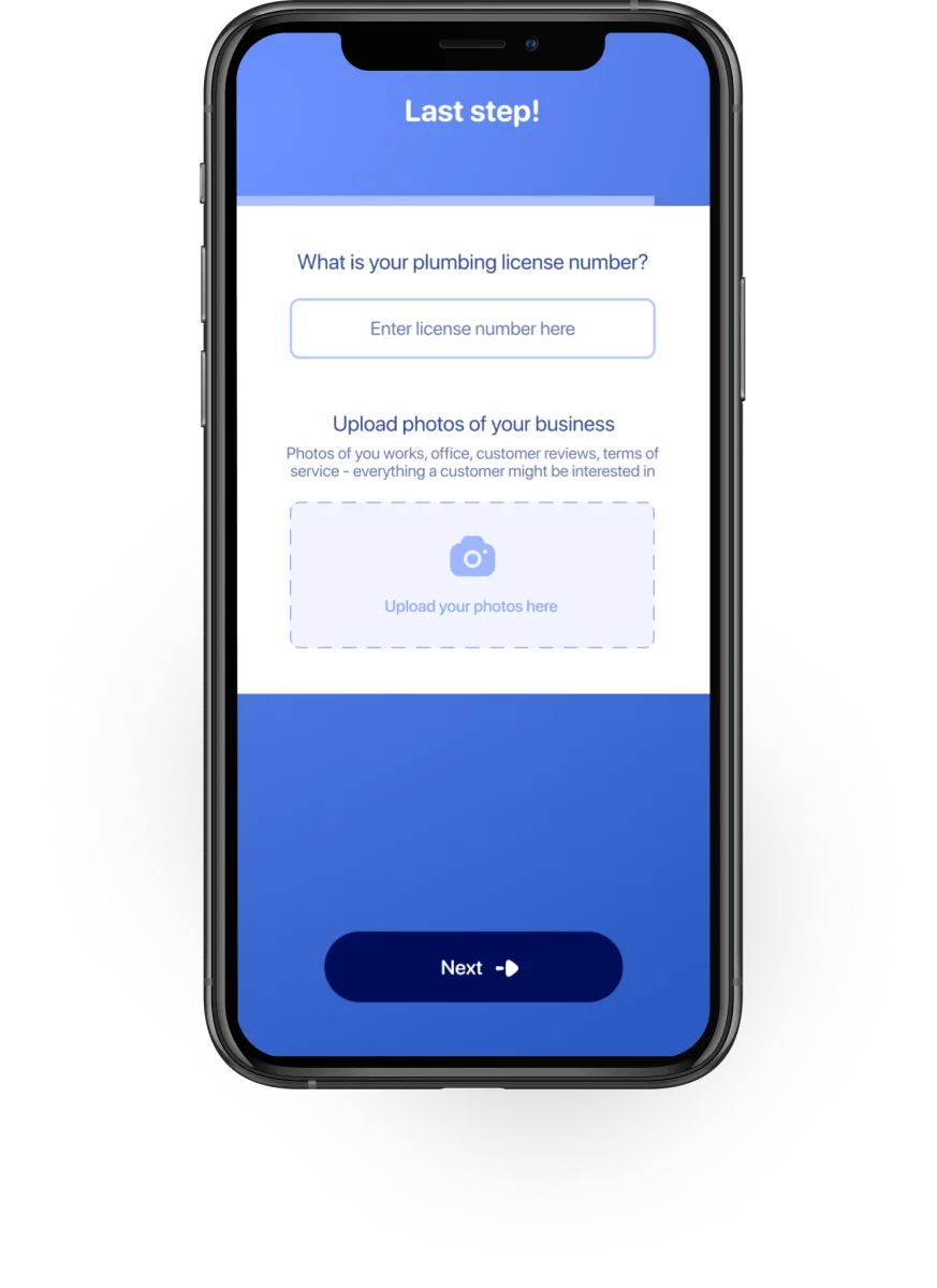
During interviews with specialists I found that they usually just sign up for every app they encounter.
Most of them are present on 3–5 platforms at the same time to maximize leads. They're used to sharing credentials — a registration form is expected, not a barrier.
And even if a specialist doesn't complete the full flow, having their email or phone number early lets the company follow up with outreach, calls, or retargeting ads.
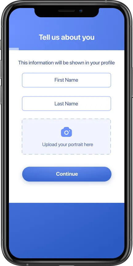
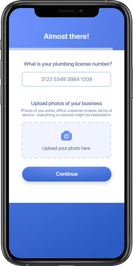
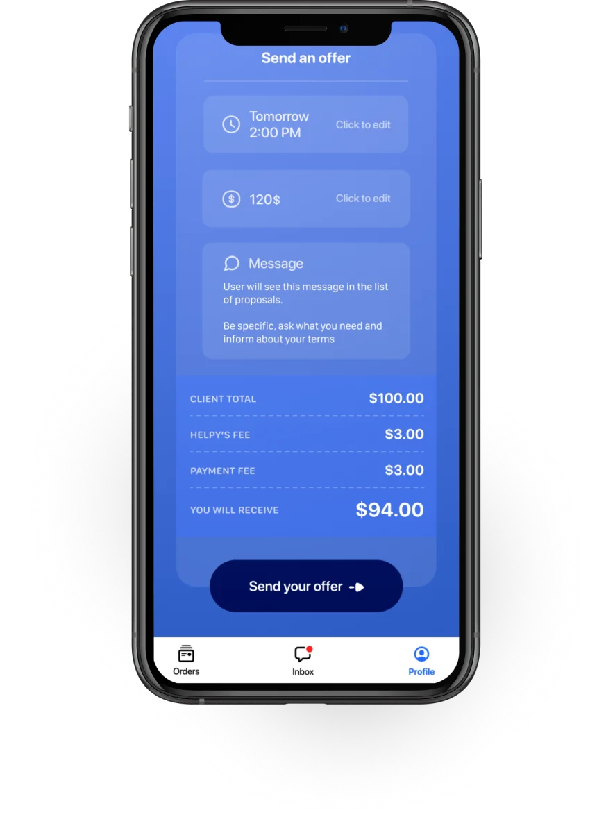
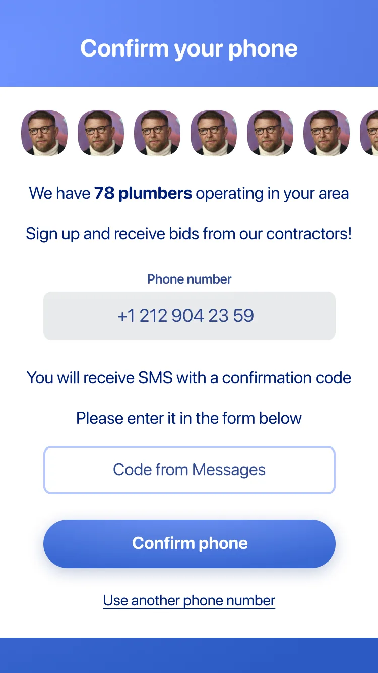
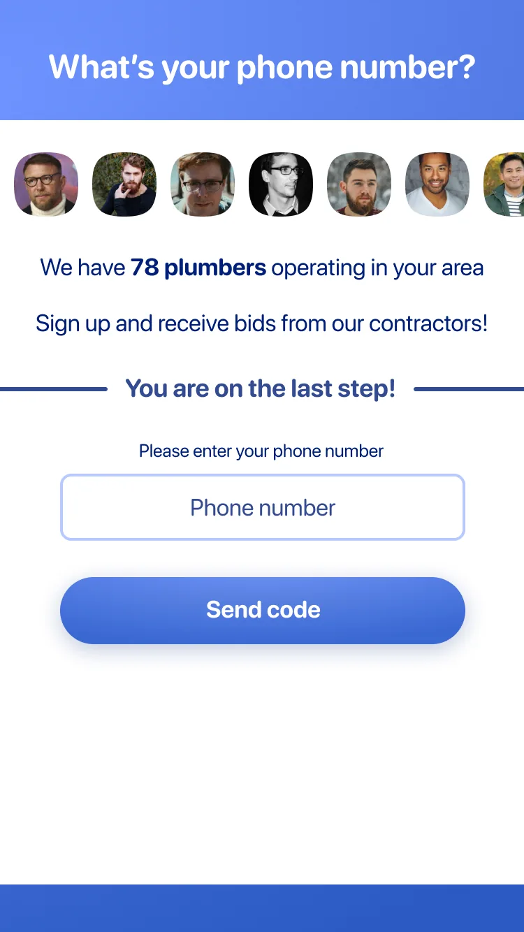
Specialist — identity, then credentials. Both asked before the first job is ever visible.
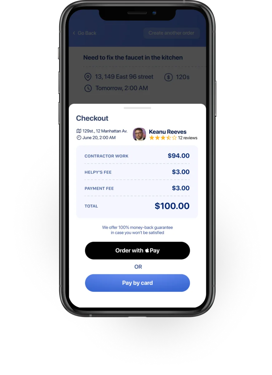
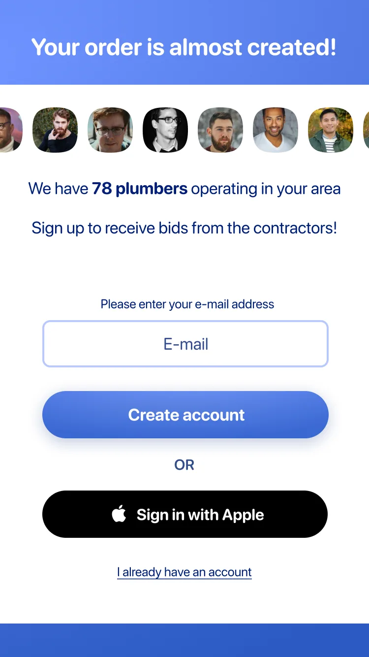
Customer — build the order first, then hit the signup wall with social proof once they're invested.
Customers are the opposite. They have a specific, urgent problem.
The last thing they want is to create an account before they even know if the platform can help.
The customer registration screen became a conversion tool: a progress bar (almost complete), a carousel of specialist avatars, and the count of available contractors in their area.
"We have 78 plumbers operating in your area" turns a registration wall into a sign that help is close.
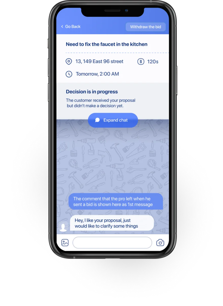
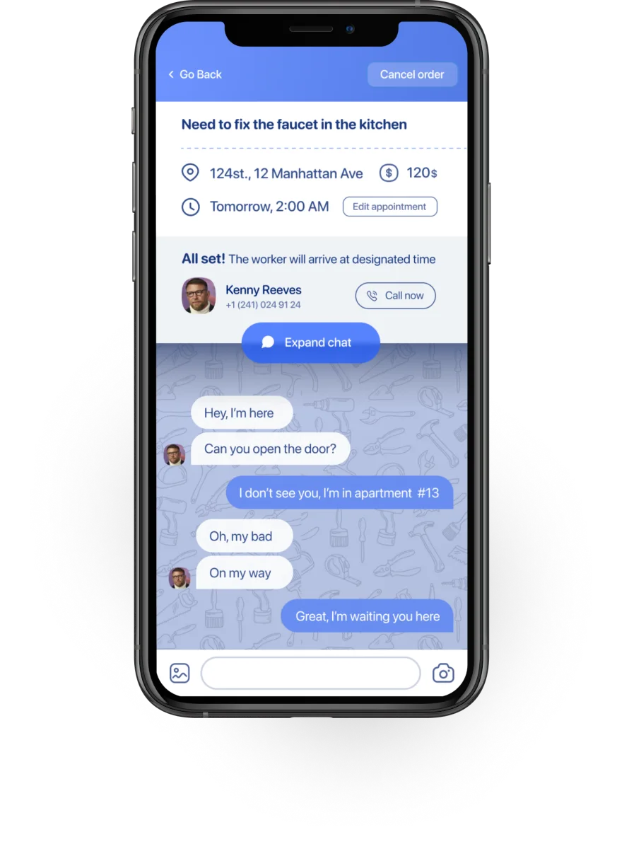
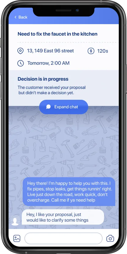
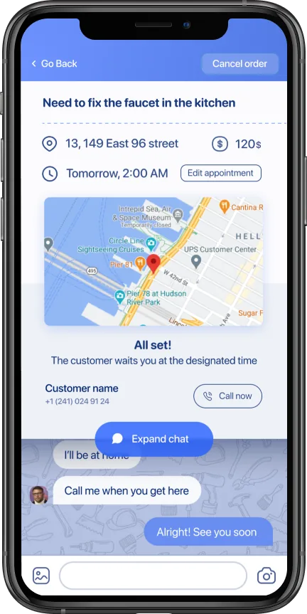
Chat inside the order, not in a separate screen.
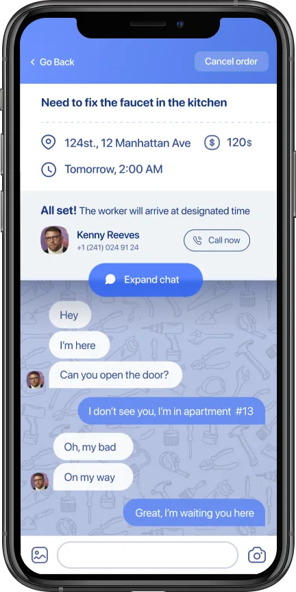
Most messages between a customer and a specialist are short: "OK", "On my way", "I'm here", "Can you open the door?"
A full-screen chat app is overkill for this kind of exchange — and it loses the context of the order.
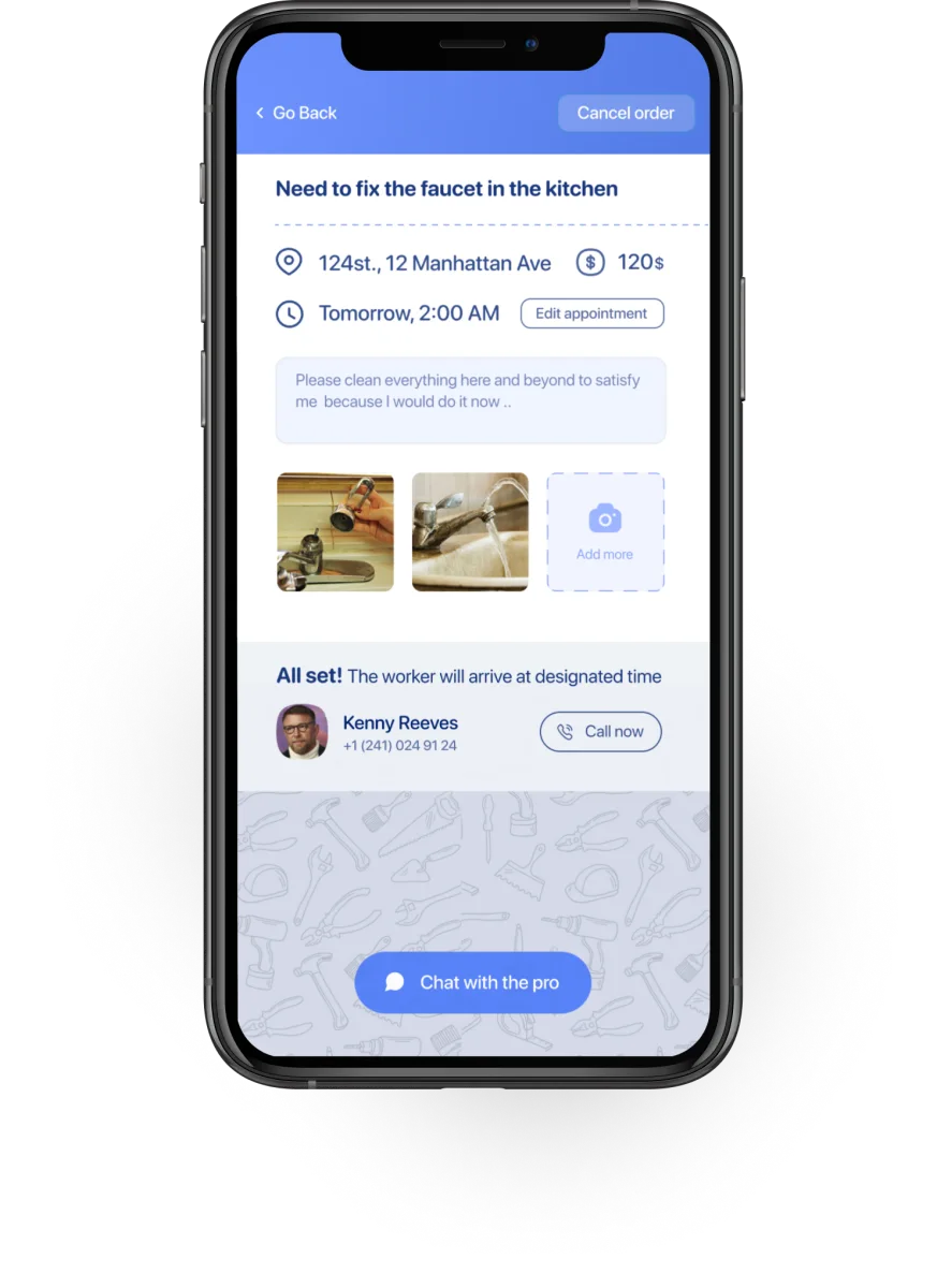
I embedded the chat directly inside the order detail screen. Order information stays visible at the top — service type, address, time, and current status.
Below that, a status bar with hot actions (call, expand chat). Below that, the chat thread scrolls.
A half-transparent dark overlay under the status bar creates a sense of depth, so users notice that the chat area is scrollable without it being explicitly labeled.
Customer — chat embedded in the order screen
Specialist — preview on the list, full chat one tap deeper. Most messages never need that tap.
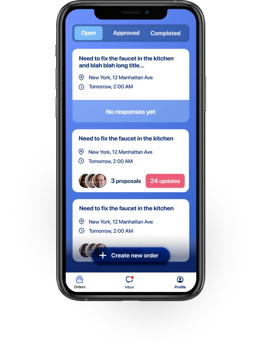
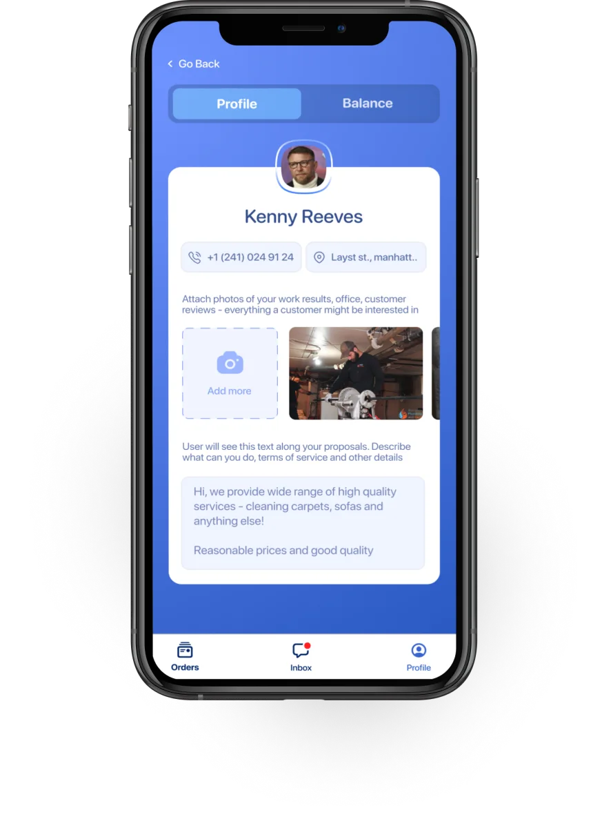
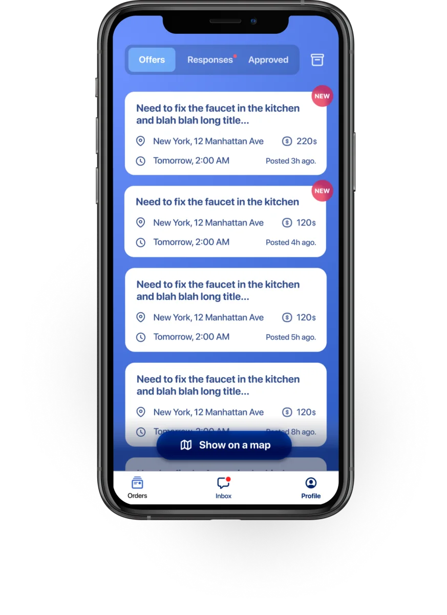
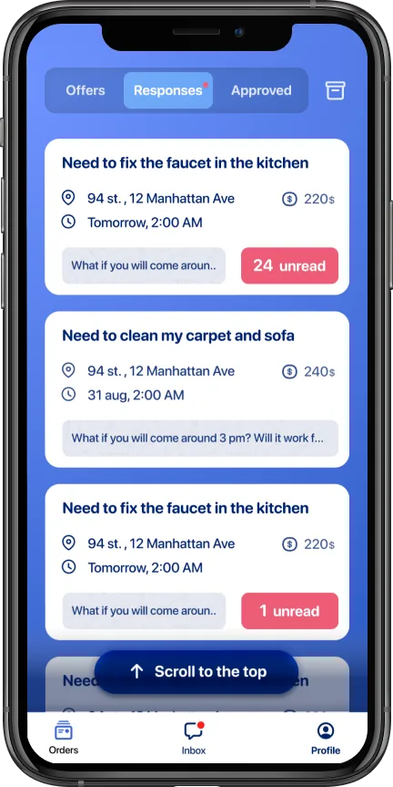
For the specialist's order list in the "Responses" tab, I added a preview of the last message directly on the order card.
If the message doesn't require a reply — and most don't — the specialist can read it without opening the order at all.
When all messages are read, the "unread" badge disappears and the message preview takes the full width.
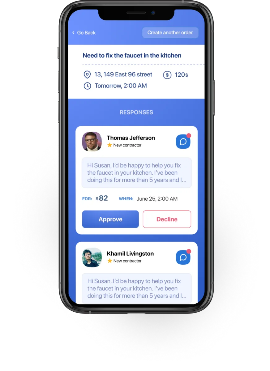
When they do tap in, the order header stays pinned — address, price, status — so the chat never loses the context it's about.
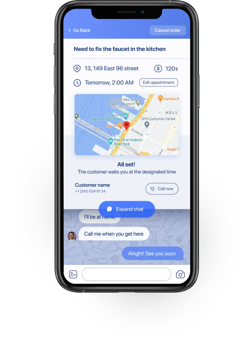
Same screen, different information.
Once a specialist is hired for a job, their primary concern shifts: they need to know when to show up and where to go.
The service details, the price negotiation, the bidding — all of that is settled. Navigation is what matters now.
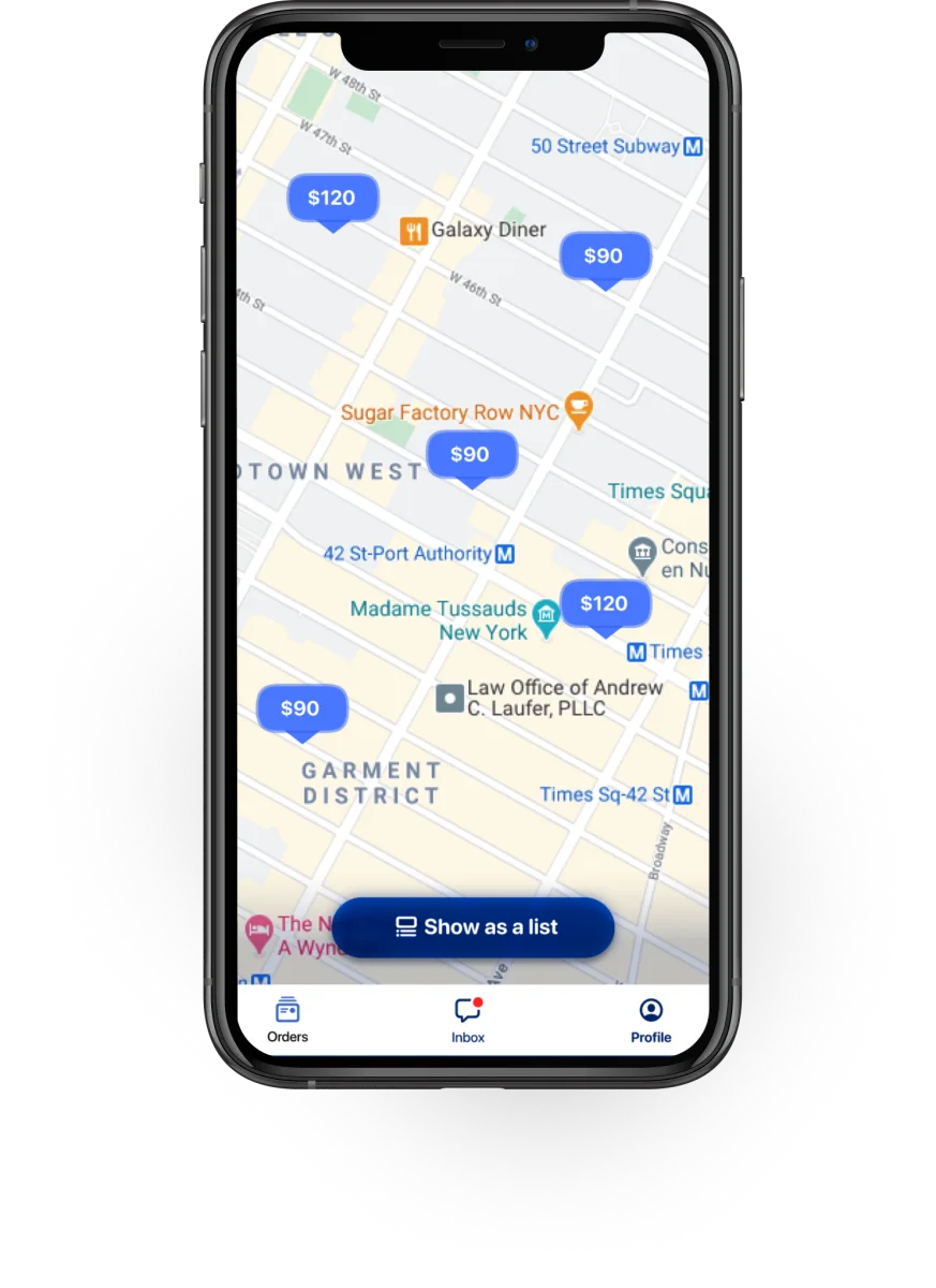
So the specialist's order screen shows a large, tappable map preview right at the top. One tap opens their preferred maps app with the destination pre-filled.
The customer sees the same order screen — but without the map. They don't need directions. They're already at the location, waiting.
Address as text only. The customer is already there — the map is just noise.
Large, tappable map at the top. One tap opens their maps app with the destination pre-filled.
"Same data, different presentation per user type" became the governing principle for the whole product. Not just the map — notifications, order lists, status labels, even the tab structure differed between the two apps.
Five surfaces out of the product. Every one resolves to a different answer per app, because the two users are doing fundamentally different jobs through the same order object.
What differentiation got us.
The product launched into a crowded market — TaskRabbit, Thumbtack, HomeAdvisor, Angie's List, Porch, Handy. The differentiation wasn't in the service categories. It was in treating each side of the marketplace as its own product.
Low-friction customer onboarding — task first, registration last — removed the biggest drop-off point. Social proof at the signup wall converted hesitant visitors into active users.
Because the signup wall sits after the order is built, the account is created on a user who's already invested. The progress bar and specialist-count social proof carry them through the last step instead of abandoning a half-typed form.
From app open to order placed. The problem-first flow (service → address → details → time → price) strips every optional field out of the critical path — the customer never stops to think about an account until the order is already on the way.
What I'd do differently.
I'd push harder on specialist retention from day one. We optimized for customer acquisition — the onboarding funnel, the social proof, the low-friction flow — because that's the easier side to measure. But a marketplace lives or dies on supply quality.
The specialists who stayed were loyal, but too many churned in the first week because there weren't enough incoming orders to keep them engaged. The right recommendation would have been to build the supply side denser in a smaller area before expanding geographically. We did it the other way around.