The manager bought it.
The operator had to live with it.
Context
A manufacturing SaaS with two users who wanted opposite things from the same screen. The buyer was closing contracts; the operator was quietly going back to paper.
Approach
Reframed the brief from "redesign for clarity" to "design for the person being monitored." Shipped three decisions, each answering to the shop floor.
Outcome
v2 shipped across every customer account. The three decisions moved support load, engagement, and operator NPS in the same direction.
Engagement was measured across all customer accounts via product telemetry. Satisfaction and support figures come from the ~63% of accounts that ran the post-launch employee survey.
The tension
Stryza is sold to a production manager who wants visibility: who's on shift, what's behind, where the defects are.
It's used by a frontline operator who has thirty seconds between machines, gloves on, and little interest in being measured.
Those two people want opposite things from the same screen.
The MVP had been built for the buyer.
Managers signed the contract, and then keeping the app in active use took constant effort.
Our reps visiting sites to retrain. Their supervisors nudging people off memory and paper.
My job wasn't to make the app prettier. It was to find a version of the product where serving the operator was also serving the manager.
Sizing the problem beyond our own account list.
A survey went out to production managers through existing customers, the founders' network, and industry LinkedIn groups. Three numbers stood out.
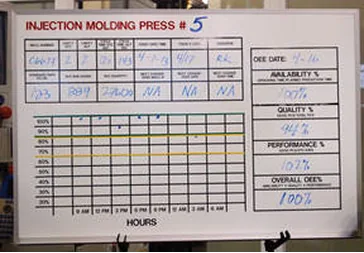
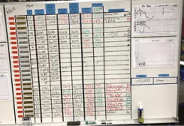
Production boards found at the plants. The thing twenty SaaS tools were losing to.
Then ten interviews, five production managers and five frontline operators, to work out why digital tools kept losing to a whiteboard.
The pattern held across every team that had tried another SaaS and churned. Two reasons came up every time.
The tool was too heavy to learn on top of a shift.
And the operators concluded it existed to monitor them, not help them.
Once that perception set in, people stopped entering real data.
Managers started getting clean dashboards made of fiction.
The rollout team spent the rest of the quarter on the floor re-teaching the app, and eventually gave up.
One of the operator interviews. "If the boss wants data, he can come look at my board."
That reframed the brief.
"Redesign the app so it's more intuitive."
"Design an app that operators will choose to use, accurately, even when no one is watching them."
Those are not the same project.
Design for the person being monitored, not the person doing the monitoring.
Most B2B redesigns map the buyer's decision to switch. I mapped the operator's decision to actually use it.
They were the real gatekeeper of whether the product worked at all.
I used a Forces of Progress frame to lay out what was pushing operators toward the app and what was pulling them back to the whiteboard.
Most B2B tools only fight for "use it." Stryza had to make sure "fake it" stopped being the easiest move.
The diagram made one thing clear: every strong force except manager pressure favored staying on paper.
And the anxieties were about being watched, not about the UI being hard. Better buttons wouldn't fix that.
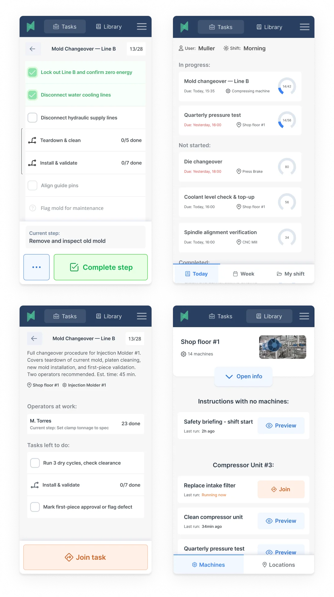
The working brief that came out was specific. The operator has to perceive the app as working for them inside the first shift they use it.
Every decision downstream had to answer to that one constraint.
If the gloves come off, we've lost him.
The naive brief would have been "reduce taps."
But we actually wanted operators in the app many times a shift. Each log and defect flag is a datapoint that replaces paper.
What mattered wasn't how many interactions. It was whether each one fit the work.
Shadowing on the floor, the event that broke adoption wasn't the Nth tap. It was the moment an operator had to pull a glove off.
Gloves off meant the app had already lost.
The operator now had to stop, strip, use the phone, put the glove back on, and often wash in between.
Real seconds of real time, plus enough friction for him to promise himself he'd do it later. Which meant never.
I turned glove removal into the unit test. Any critical-path flow that forced gloves off was broken.
The job-completion path an operator actually walks through, on the floor, every time. The two amber-marked nodes are where the MVP forced gloves off.
The audit on the existing job-completion flow turned up two glove-off moments and three more friction points. The redesign addressed all five.
This constraint did more than shape the mobile app. It reshaped the product's information hierarchy.
If the operator view had to stay gloves-on, the manager dashboard couldn't be the primary surface for data entry. Only for reading.
Design the shift, not the screen.
Up to this point the design was still screen-shaped. A factory shift is not.
There's a handover at six in the morning. A supervisor walk every few hours.
Machines that go down without warning. Wi-Fi that drops between bays.
A foreman whose unofficial job is to reconcile the app's picture of reality with the real one.
The app is one actor in a longer play.
Designing the screen without the play is how you get software that looks intuitive in a demo and dies on the floor.
A bay during a shift visit. Half the interaction problems turned out to be coordination problems.
Two consequences surfaced from the blueprint that a screen-by-screen review never would.
First, the app had to work offline as the default, not a fallback. Wi-Fi gaps between bays were the norm.
Every critical-path flow needed local persistence with later sync.
Second, the supervisor walk was already happening twice a shift. Instead of pretending the logs would always be clean, I gave supervisors a one-tap "flag this" affordance to correct state on their rounds.
The trust loop for managers stopped depending on the app being right, and started depending on the app being fixable.
The screen turned out to be roughly ten percent of the product.
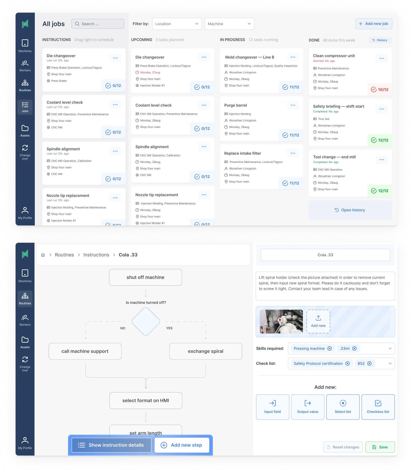
Deciding what not to build.
The tempting next move was to list features and rank them by impact and effort. I'd done that in early drafts.
That kind of matrix ranks things. It doesn't tell you why you're building them.
I rebuilt the plan as an Opportunity Solution Tree, so every module on the roadmap traced back to a problem we'd actually seen on the floor, and every deferred module had a visible reason for the delay.
The tree's real job was saying no.
Worker's recordbook had been popular in internal workshops. It addressed the right opportunity, but the path to the outcome was weaker than Visual instruction builder's, and the team had the bandwidth for one.
Training video library had been pitched as a faster way to compress new-hire ramp time.
The tree showed it sat under the same opportunity as Skills management, and Skills management was the cheaper path to signal.
Videos needed customer-side content work we couldn't commit to yet.
V1 shipped at two modules: Jobs planner and Machines management, the two the floor needed day one.
Skills management followed in v2, Visual instruction builder in v3 once the first releases had stabilized.
That scope call is the one that let us ship v1 on schedule without the team burning out chasing a four-module surface.
Testing it with the hands that had to use it.
I wired the chosen modules into interactive Figma prototypes and took them to the same factories that had shared their boards with me during discovery.
Three rounds of prototype interviews, five operators and five managers each.
On-floor when the shift allowed, gloves on for operator sessions.
Round one caught the expected misses.
Round two caught the ones I hadn't. Operators kept swiping up on a scrollable tile to dismiss it. My prototype was treating that swipe as a selection.
Round three was the test of "would an operator use this without me standing next to him."
The answer became yes before the third round closed.
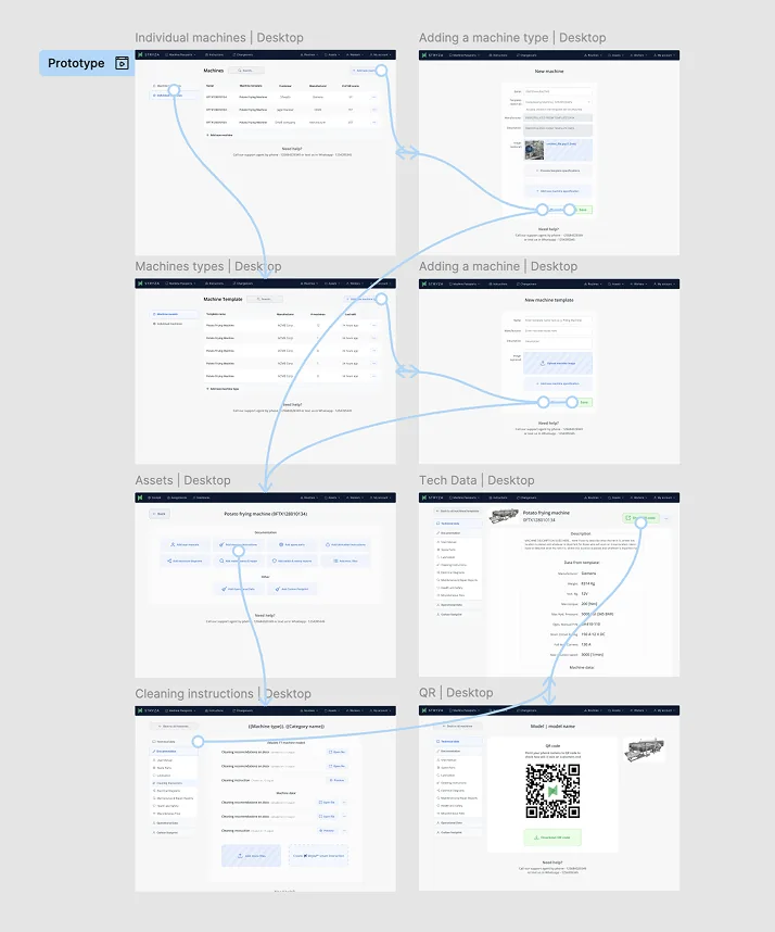
Prototype flow map taken into on-floor testing. Each branch was a task to complete end-to-end without help.
A design system that assumed the floor.
I built the component library from scratch against the constraints the decisions had put on the product.
Two environments, one system.
Desktop, for managers in office lighting reading data they didn't enter themselves.
Information density high, colour meaningful, no tap targets needed.
Mobile, for operators on the floor with gloves and variable lighting.
Tap targets oversized. High-contrast states even under LED glare. Primary actions always within thumb reach from the device edge.
Every token carried both sides. Typography, spacing, colour, state.
Components were named by intent rather than by surface, so the engineering team could build one and render it correctly in either environment.
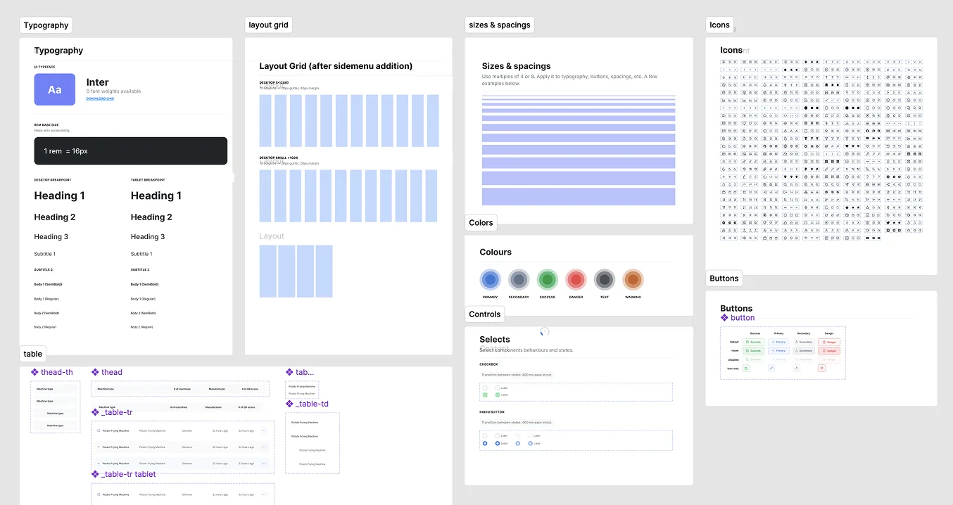
Primitives: typography, layout grid, spacing, colours, icons. About forty components were built on top of these; the system kept expanding after launch.
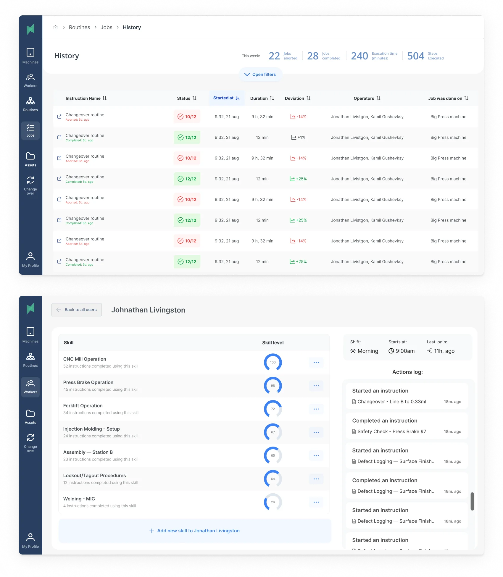
Shipping it through four engineers, a PM, and a sales team that wanted the dashboard yesterday.
I was the only designer on Stryza, but the decisions above only held because the rest of the team held them with me.
The working group was four engineers split across mobile and web, one PM, and the two founders running sales and customer success.
How the frameworks travelled. Forces of Progress and the Opportunity Solution Tree started as my private tools.
They became shared after I ran a ninety-minute session with the founders and PM to rebuild the tree together from the interviews.
Two of the four deferrals on the final tree were the founders' calls, not mine.
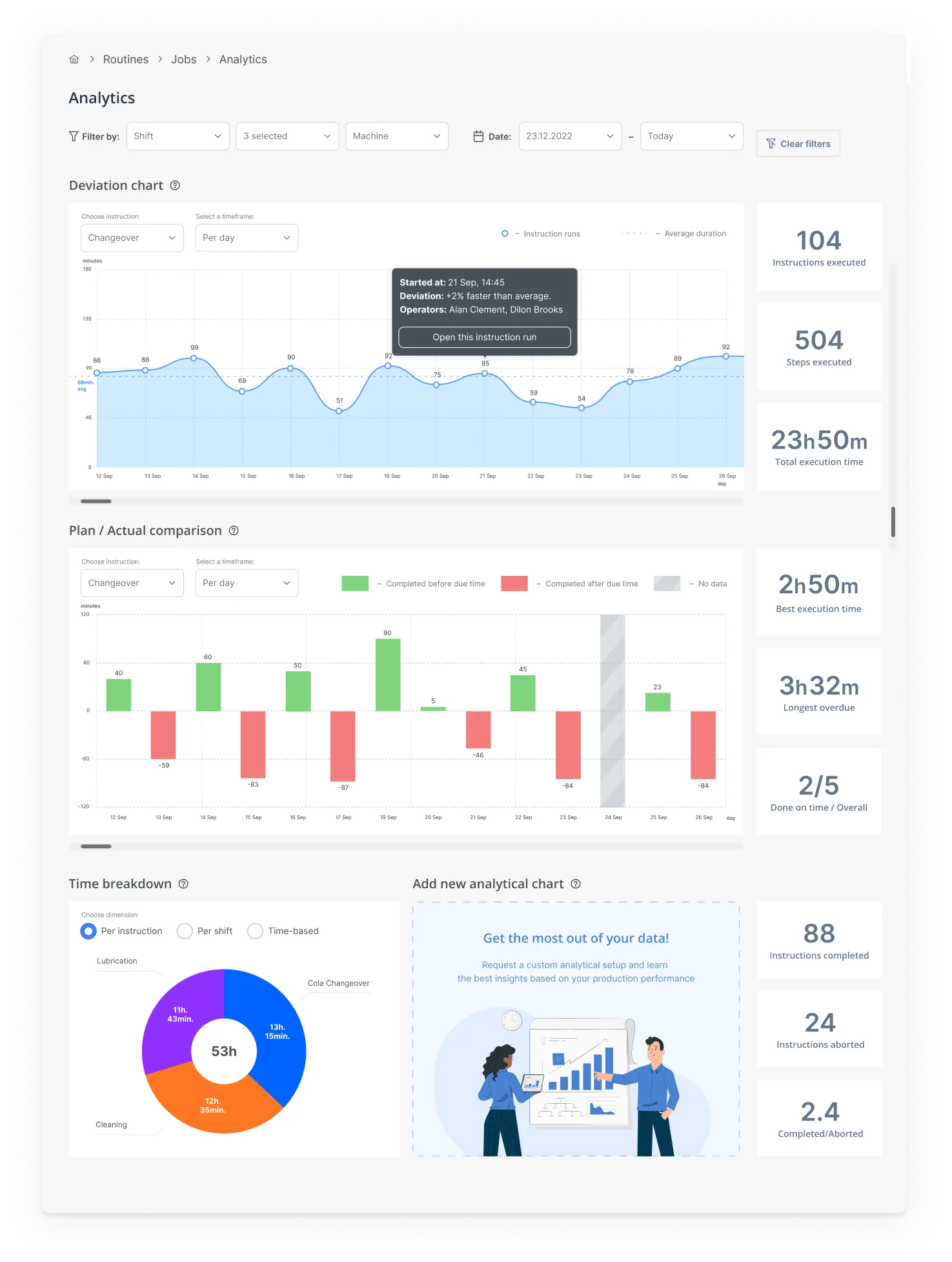
How we knew it was working before the survey. I worked with the mobile engineer to instrument three events from day one of v2 rollout.
Time-to-first-log per new operator, session count per shift, and glove-off proxy events (any tap into a text field or pinch gesture on the operator path).
The glove-off proxy was the one I cared about most.
It dropped to near zero in the first two weeks, which was the earliest signal that Decision 2 had actually landed in code and not just in Figma.
The +23 and −79 numbers confirmed it three months later.
The instrumentation is what let us stop worrying about it three months earlier.
What the three decisions actually moved.
v2 shipped across all customer accounts on schedule. Three months after rollout we measured against the v1 baseline.
The Decision 1 payoff. Operators stopped needing help because the UI matched the work they were actually doing, not a manager's mental model of it.
The PDF manual the rollout team had been carrying onto sites became unnecessary.
The Decision 2 payoff. Average usage time and tasks per shift both went up.
Lighter, gloves-on flows meant operators stayed inside the app for the small interactions that used to live on paper.
Measured across both operators and managers. The shift in operator NPS is what's interesting here.
The Decision 3 framing, building around the shift rather than the screen, was the one operators noticed.
What I'd do differently.
Two things, and they're the same lesson.
I should have pushed harder against the "manager dashboard first" instinct from sales.
The dashboard was the easy thing to demo and the easy thing to sell, but it was the wrong surface to lead with.
Sequencing the dashboard before the operator app meant we spent a quarter optimizing the surface that benefitted least from the new design philosophy.
We caught up, but we didn't have to lose that quarter.
I'd also ship offline mode earlier. We knew Wi-Fi gaps were the norm, not the exception, by the third week of discovery.
Treating offline as a follow-up cost us adoption on the floor while reps had to keep explaining why the app didn't work in parts of the building.
Both calls have the same shape. When the operator's reality and the buyer's expectations conflicted, I let the buyer's expectations set the ship order.
The case study above is mostly about not doing that. The honest version is I did it twice anyway.